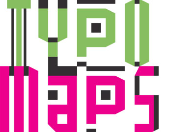
T Y P O M A P S
experimental typography
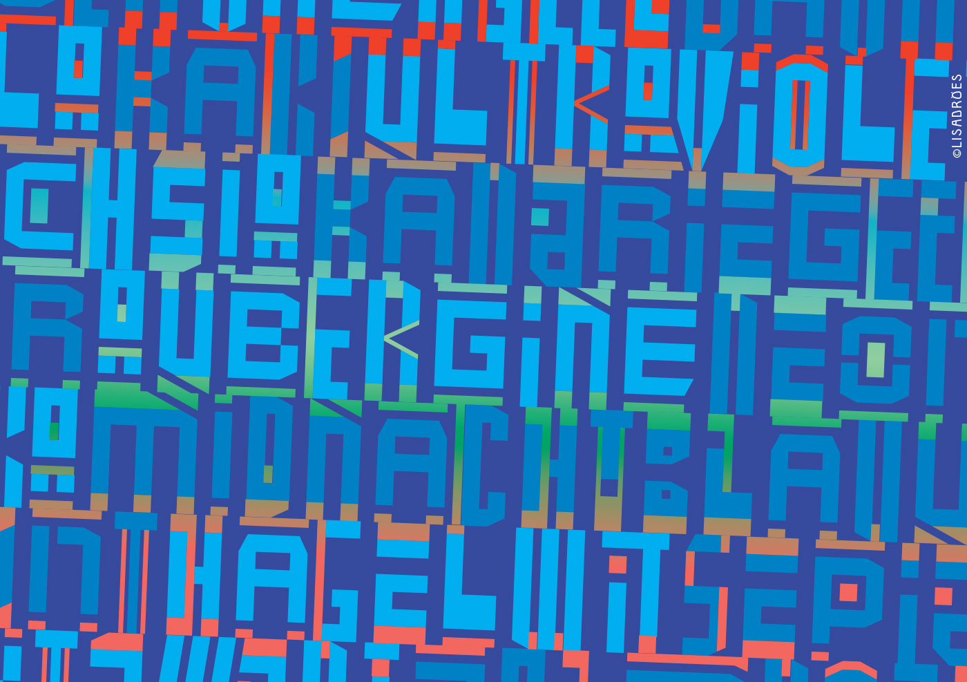
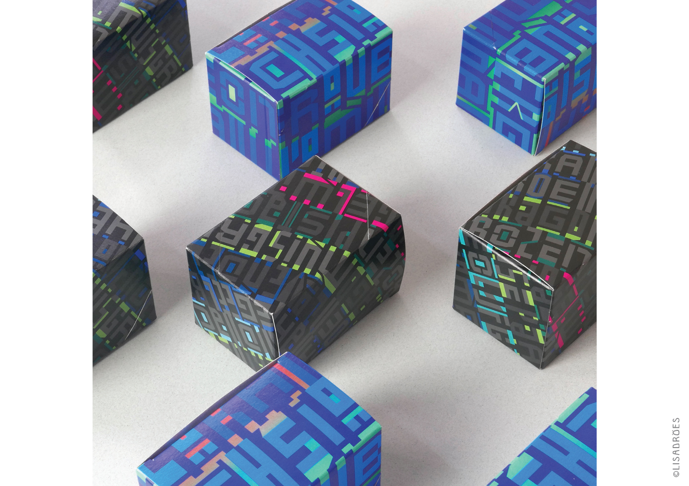
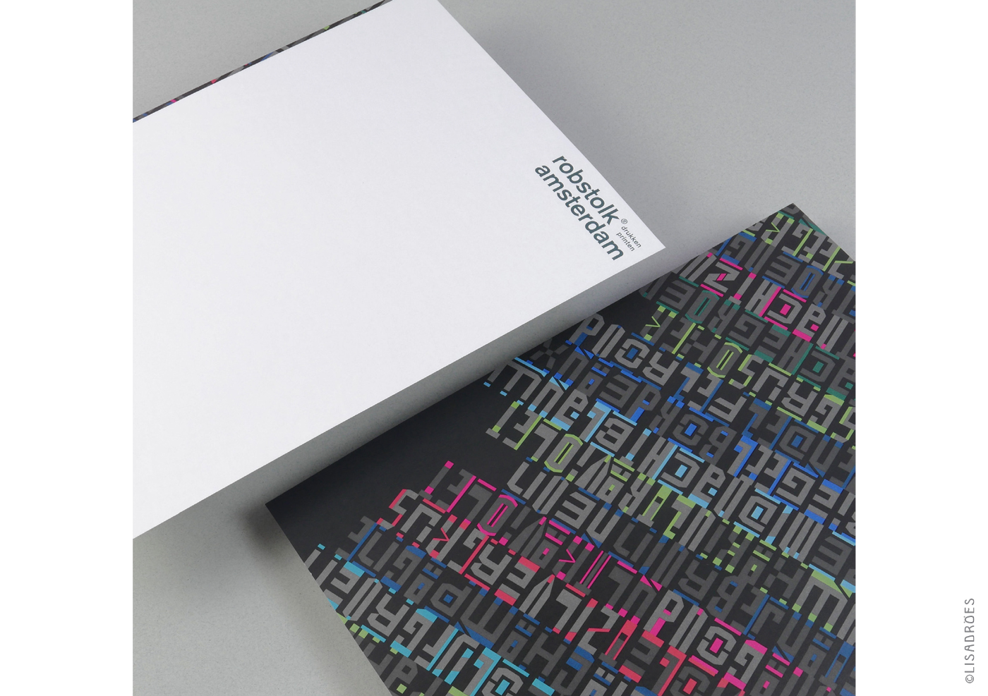


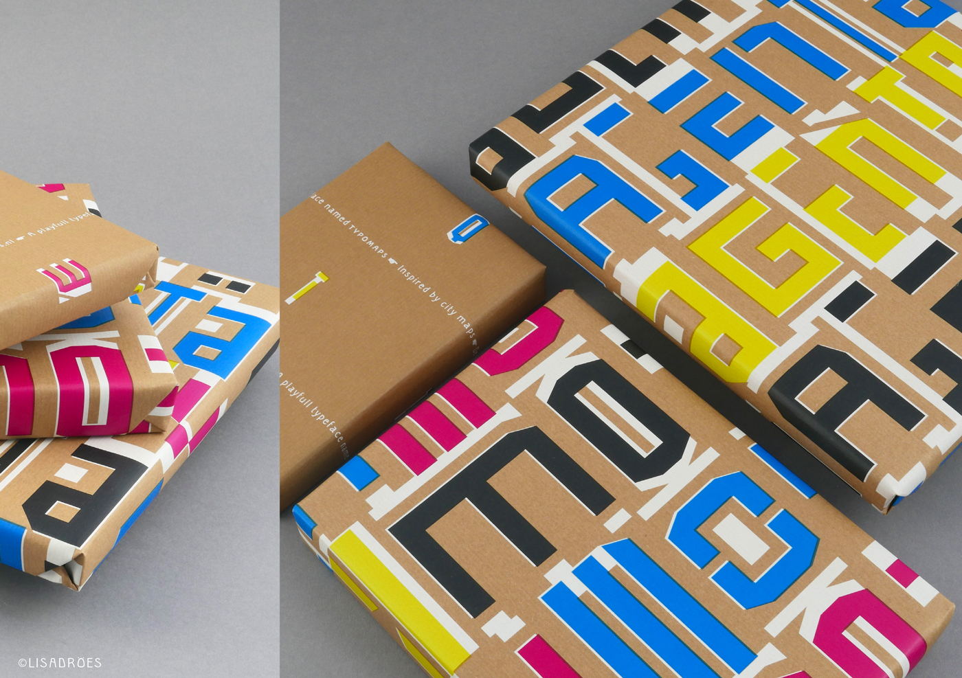

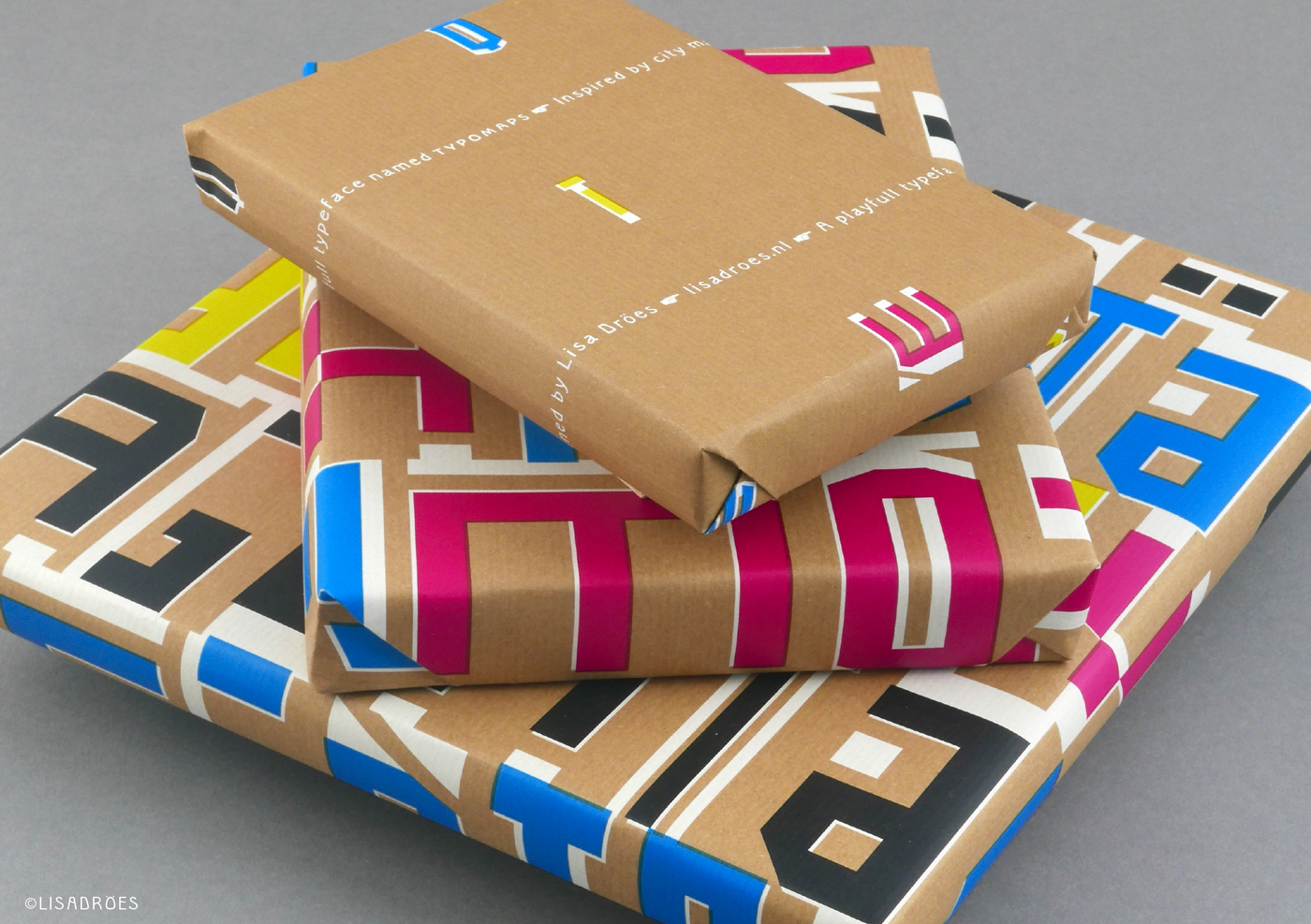
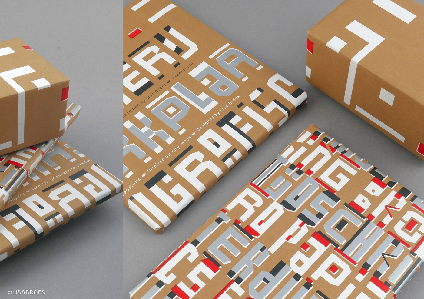


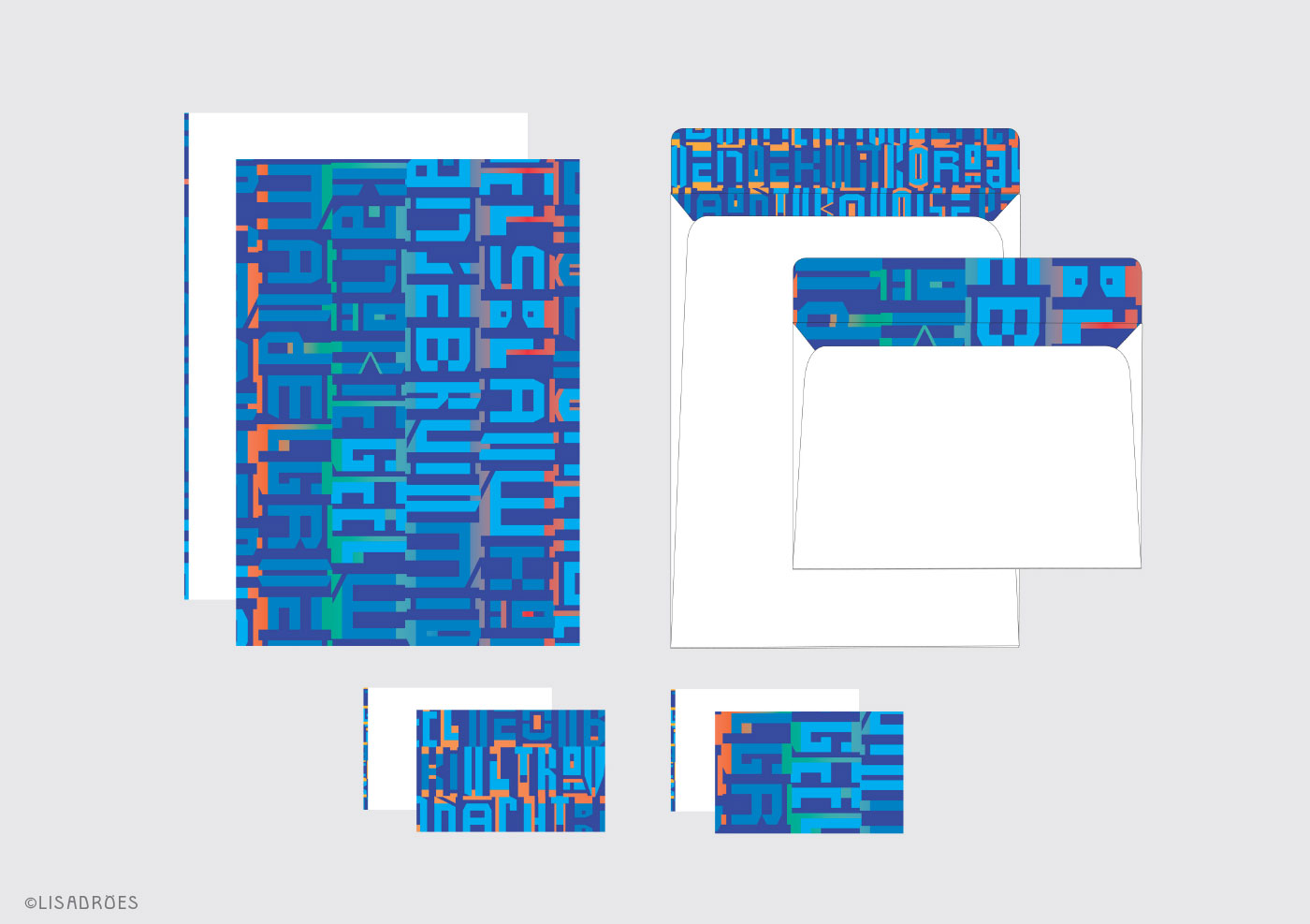
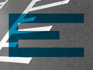
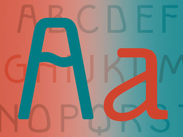
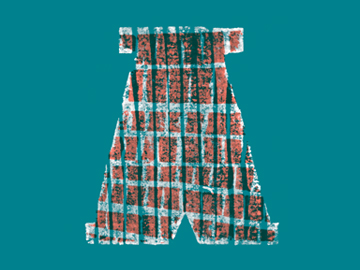
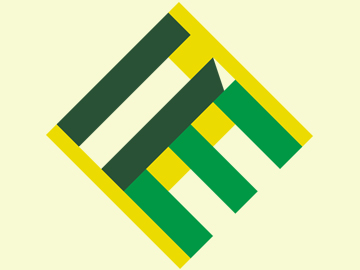
Controlled chaos. For the corporate identity of Rob Stolk I created an experimental typeface inspired by the graphic patterns of city maps.
The idea was to create a playfull typeface that becomes a pattern like the rhythm and beat of the city.
Every letter has three different variations to play around with. To give it a more map-like feeling I also added a series of ligatures, enabling you to make a wide variety of patterns.